A complete identity, built to carry weight.
The 2024 Tough Trucks rebrand brought the business into a more cohesive visual language. Developed independently, the work extended from the core identity and brand guide to the showroom, vehicle displays, workwear, merchandise and delivery materials.
01 / The shift
A clearerdirection.
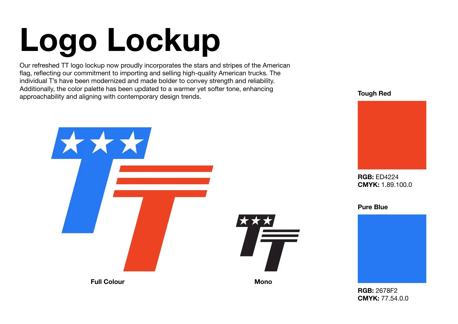
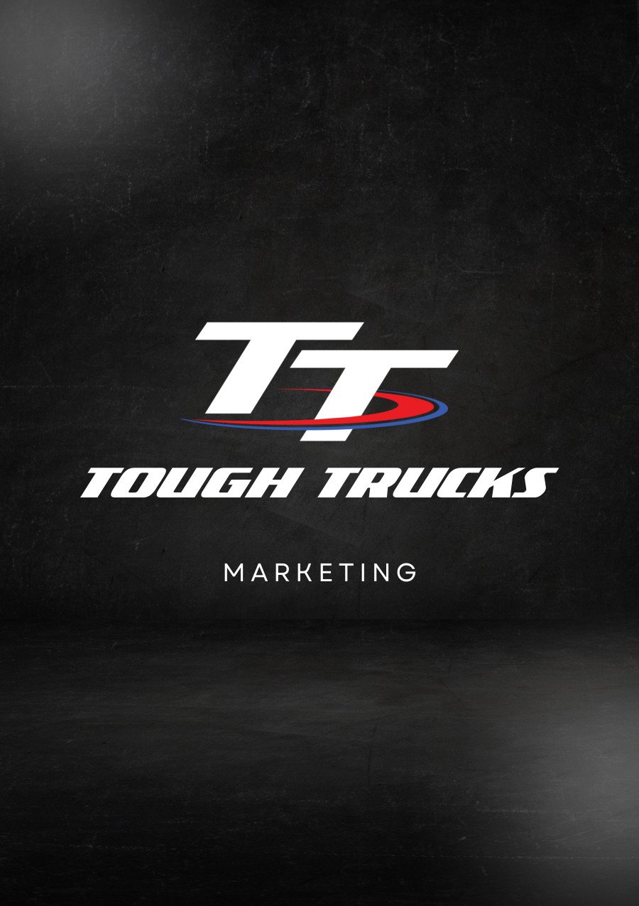
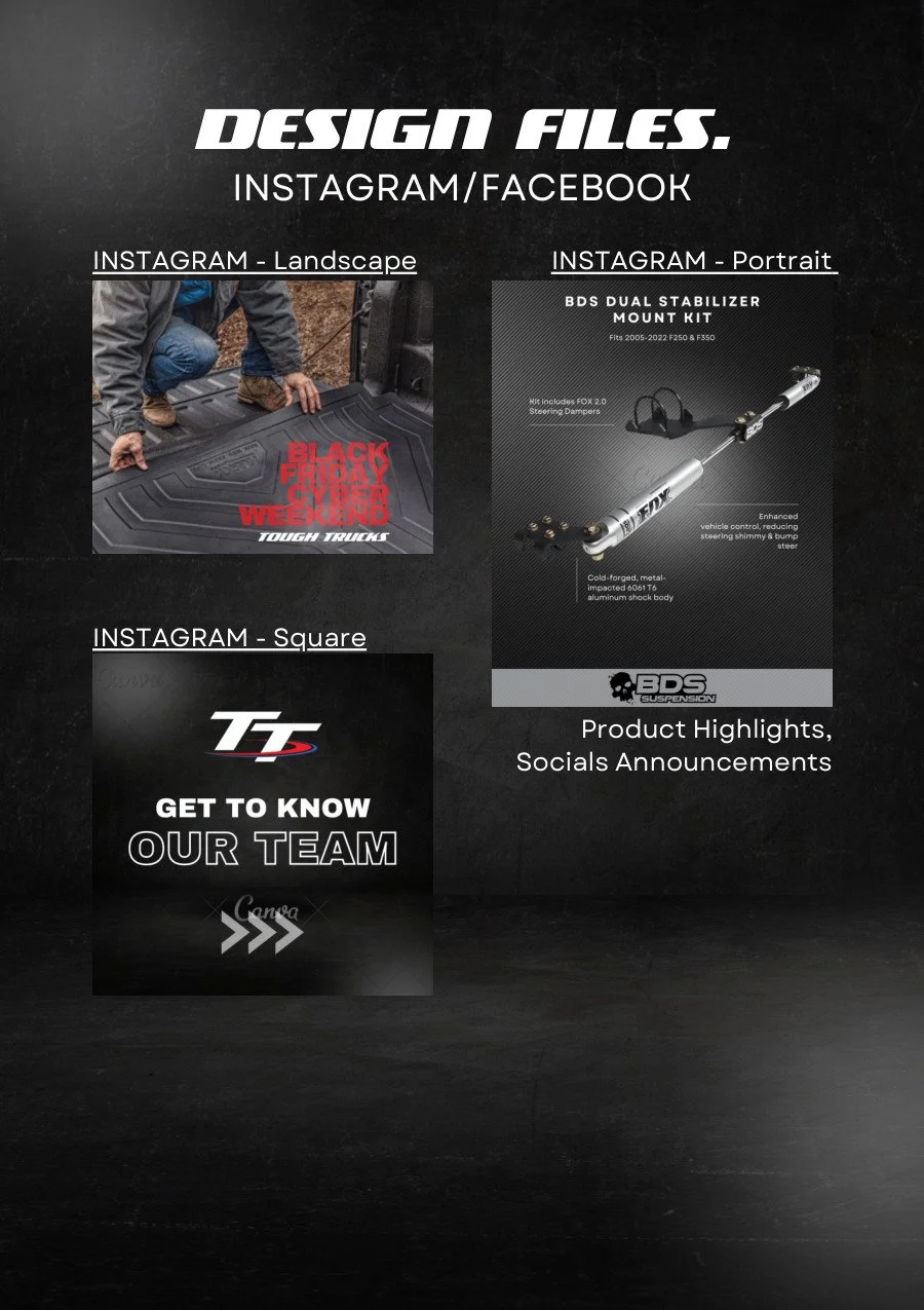
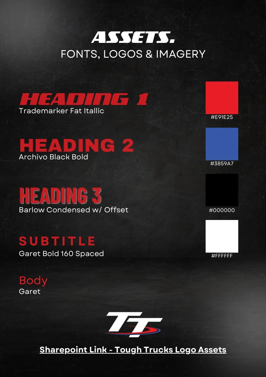
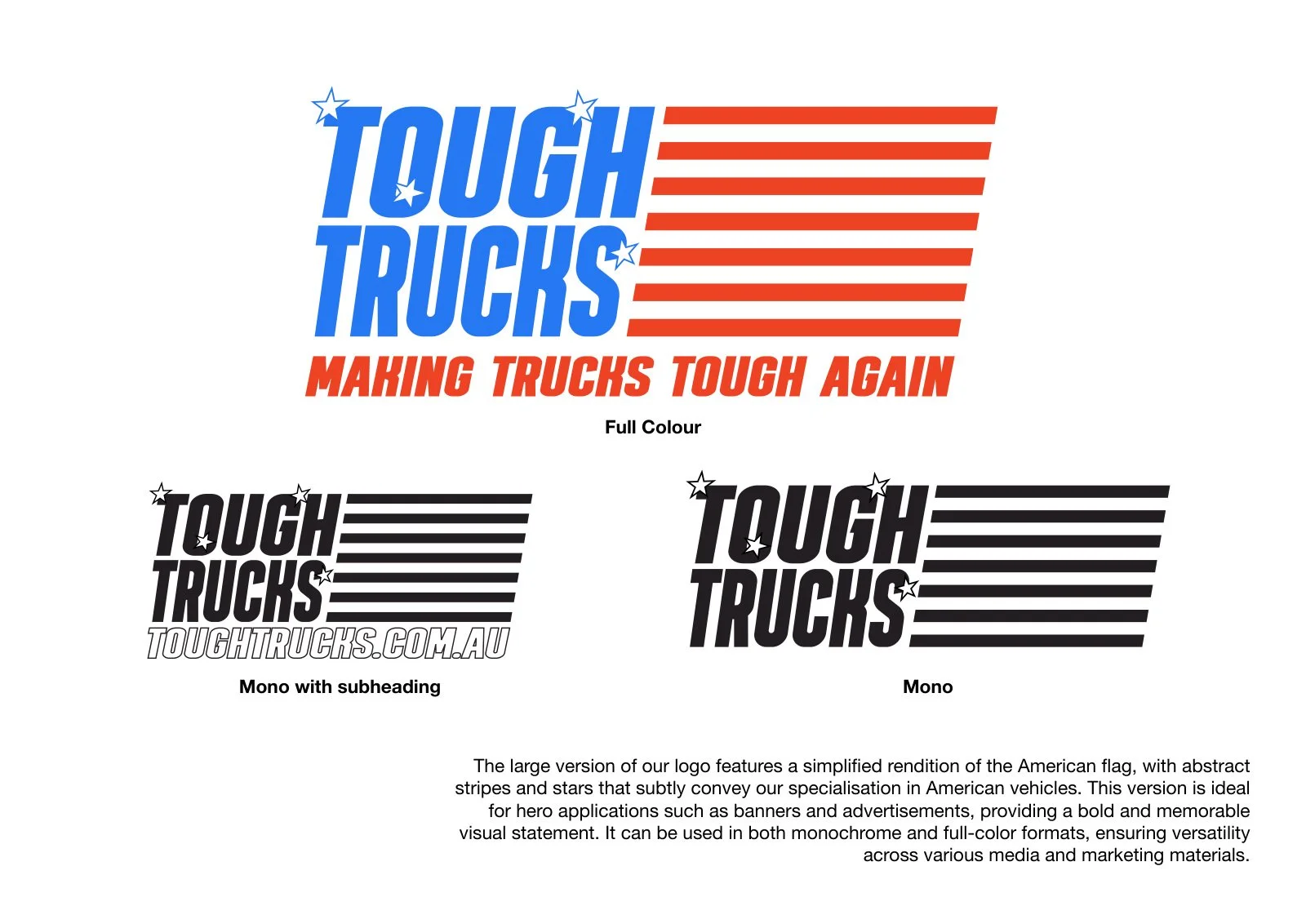
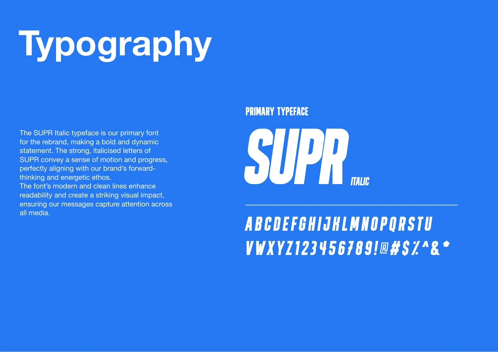
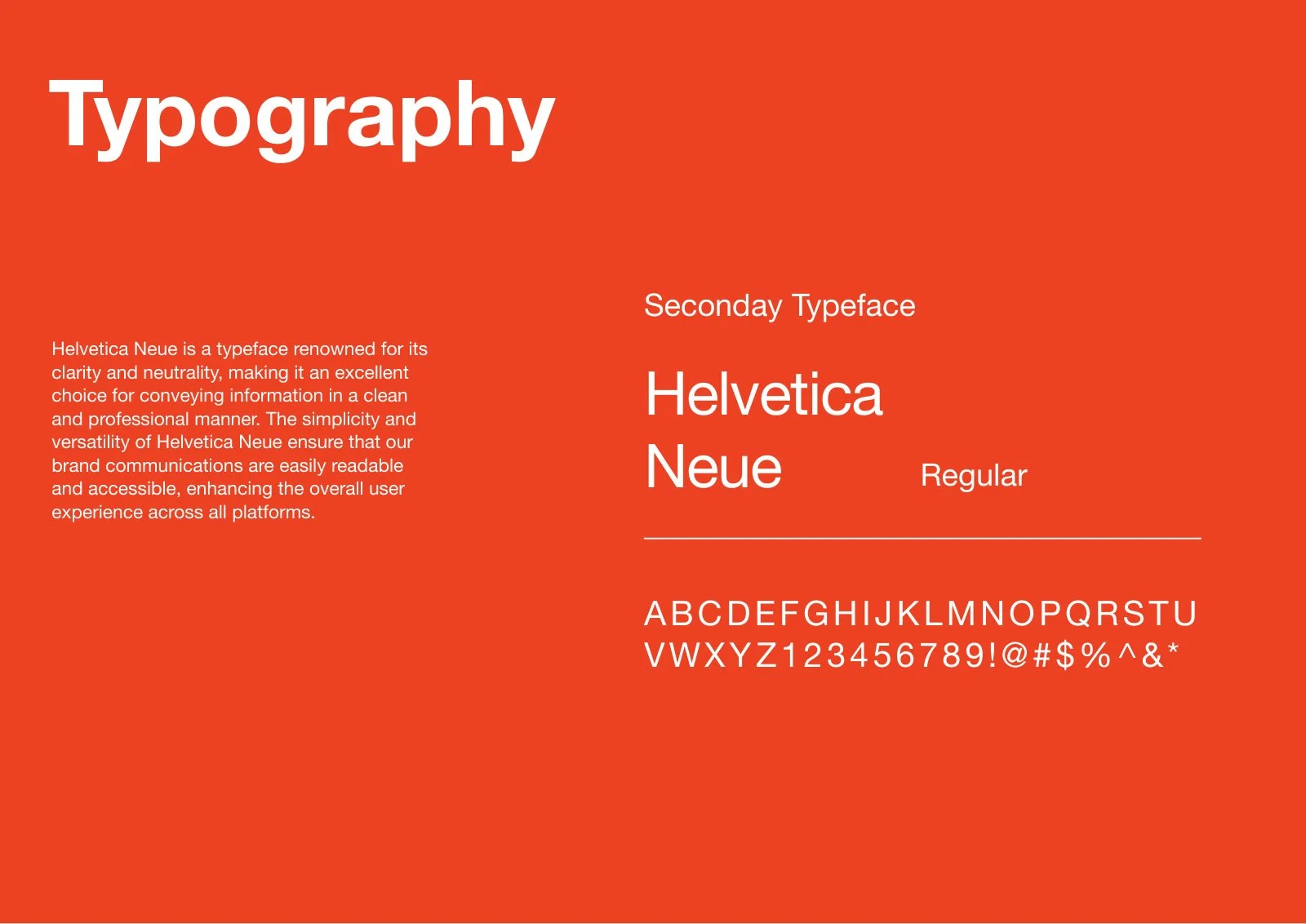
The earlier guide leaned on dark textures, red accents and several typographic treatments. The rebrand established a more direct system: a recognisable monogram, a strong wordmark and a defined red-and-blue palette that could work across very different formats.
View original design references
02 / Identity system
One identity.Room to move.
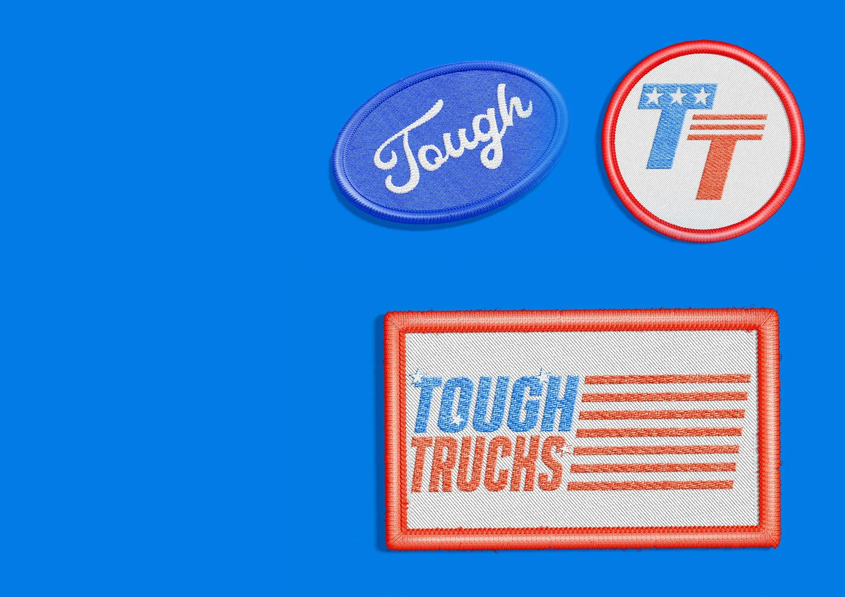
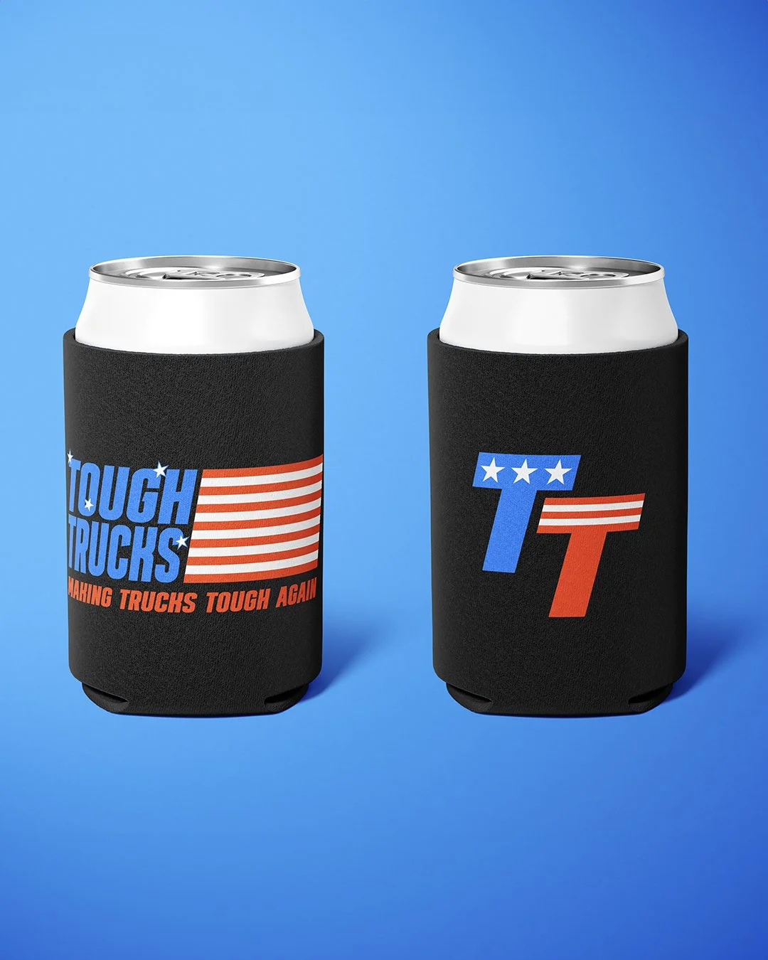
The TT monogram condenses stars and stripes into a compact mark. The full wordmark gives the identity a louder register, while monochrome versions allow it to carry through workwear, print and signage without losing its shape.
03 / Environment
From the guideto the floor.
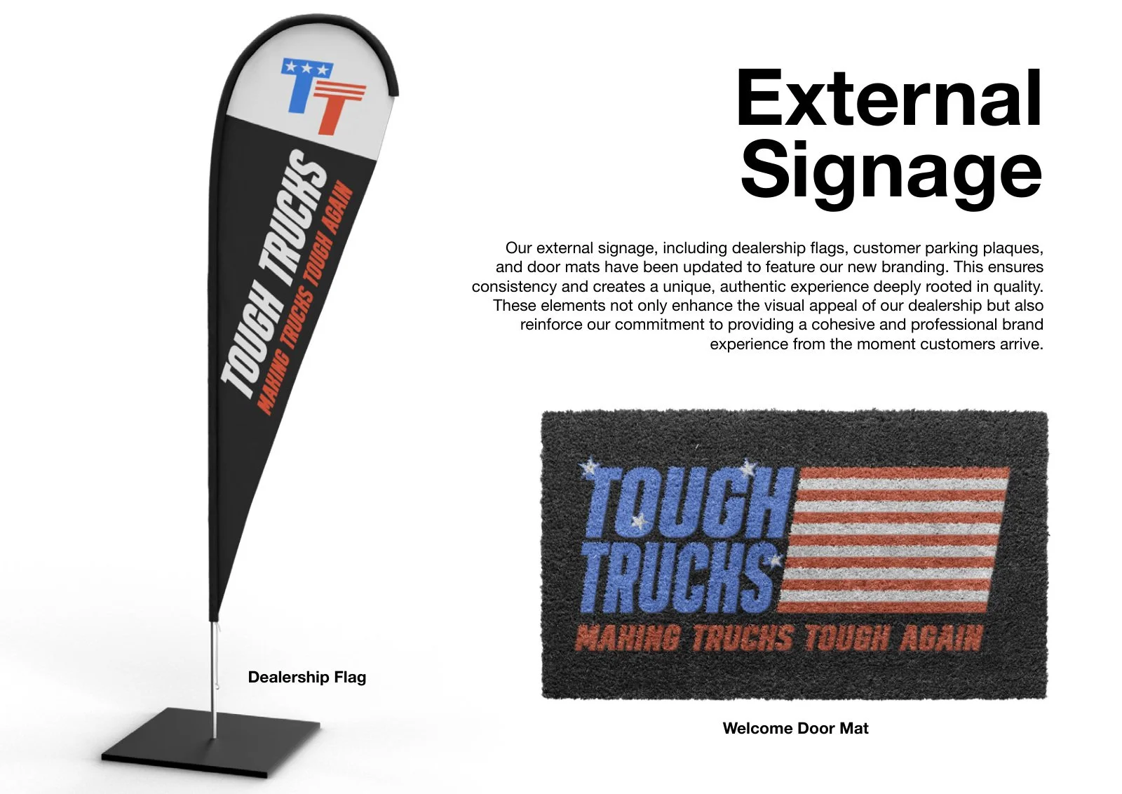
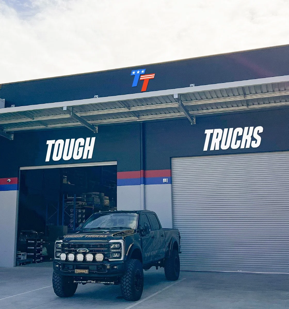
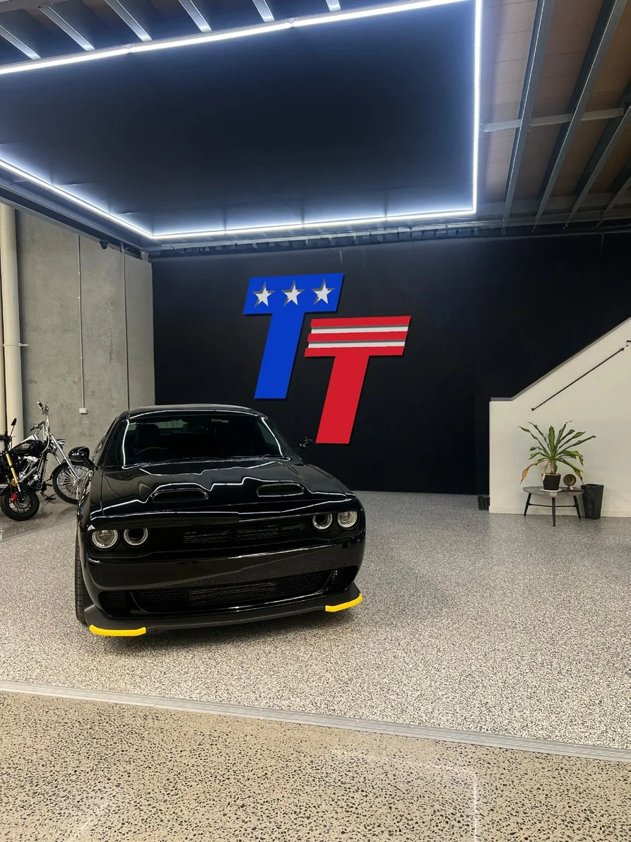
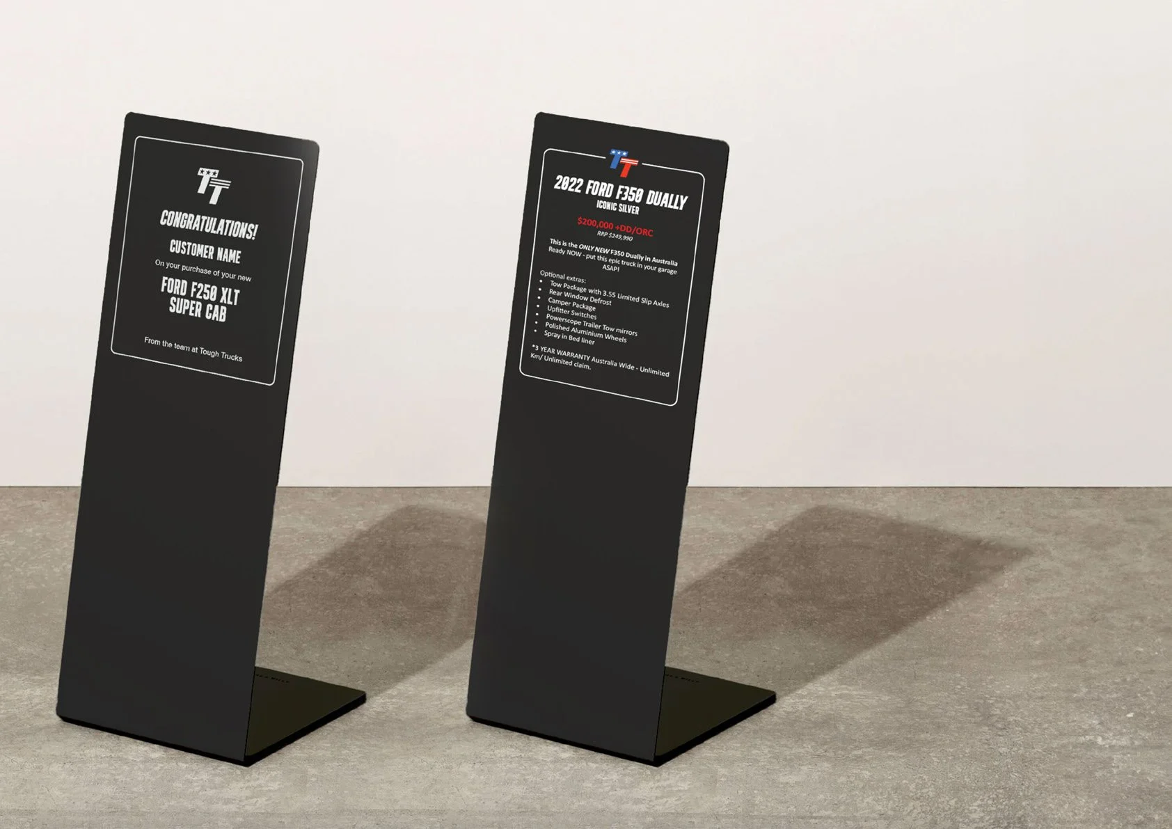
The same visual language carries through dealership signage, the showroom and individual vehicle displays. The display design uses a formed aluminium sheet with a black powder-coated finish, laser-engraved branding and replaceable information graphics.
04 / Workwear & merchandise
Made tobe worn.
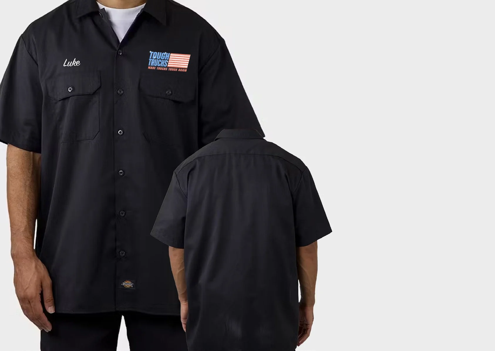
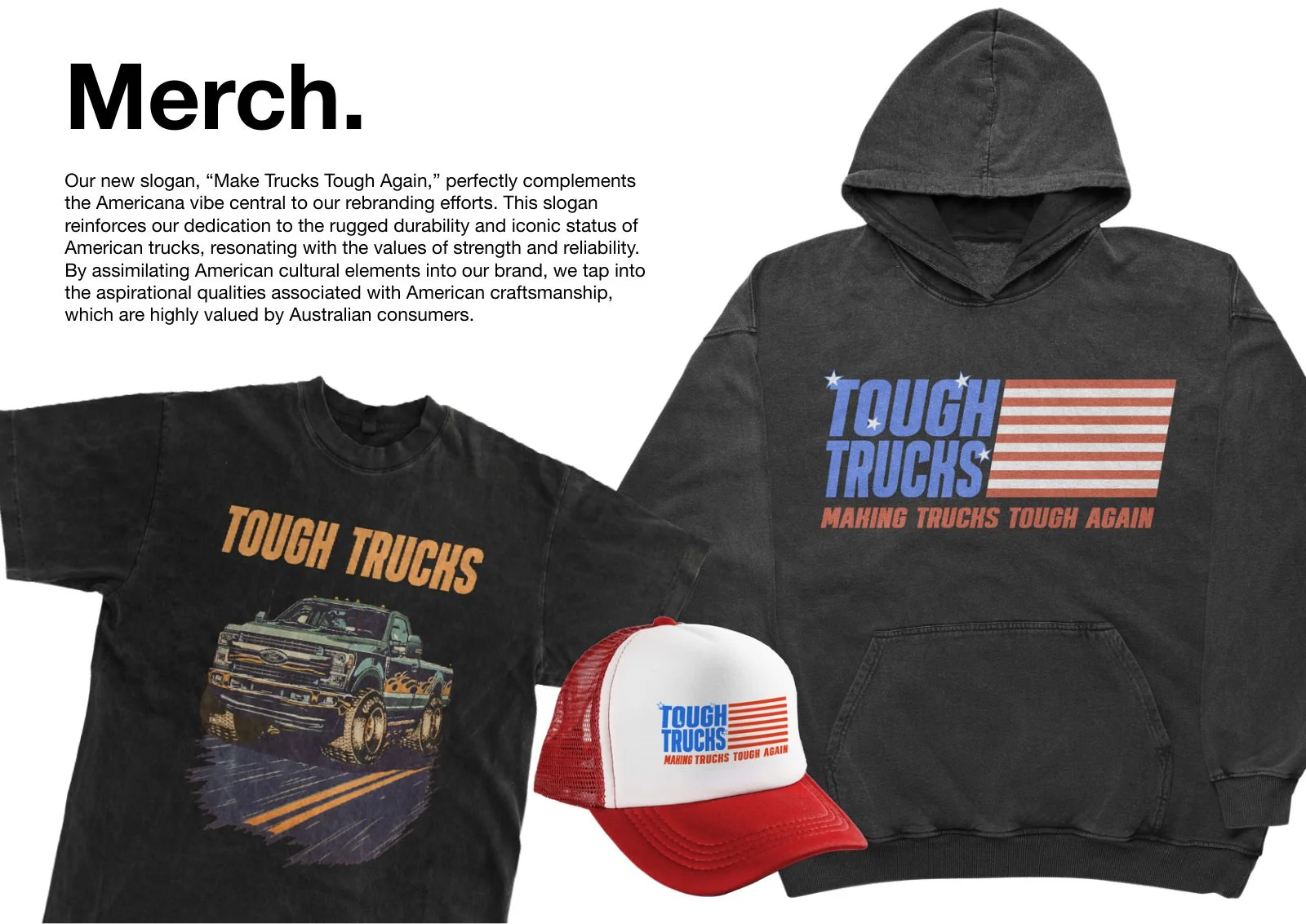
Patches, shirts and merchandise bring the identity closer to the people behind the vehicles. The compact mark and larger flag lockup give each application an appropriate scale, from a small workwear detail to a full print.
05 / Delivery materials
A consideredhandover.
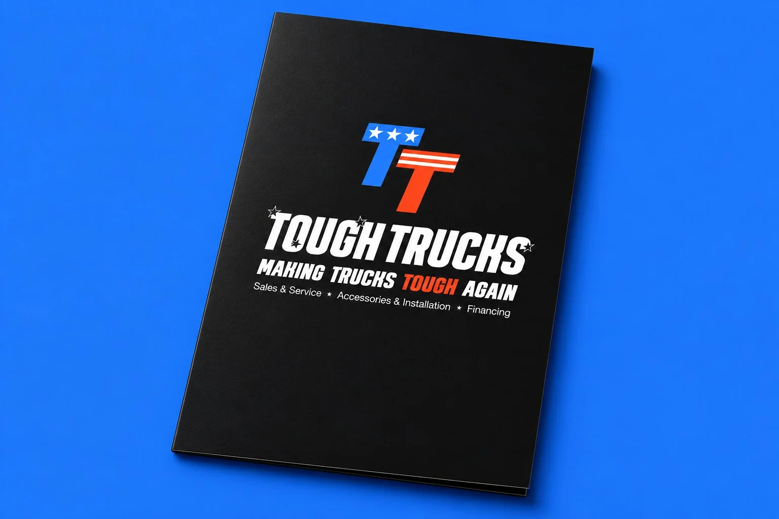
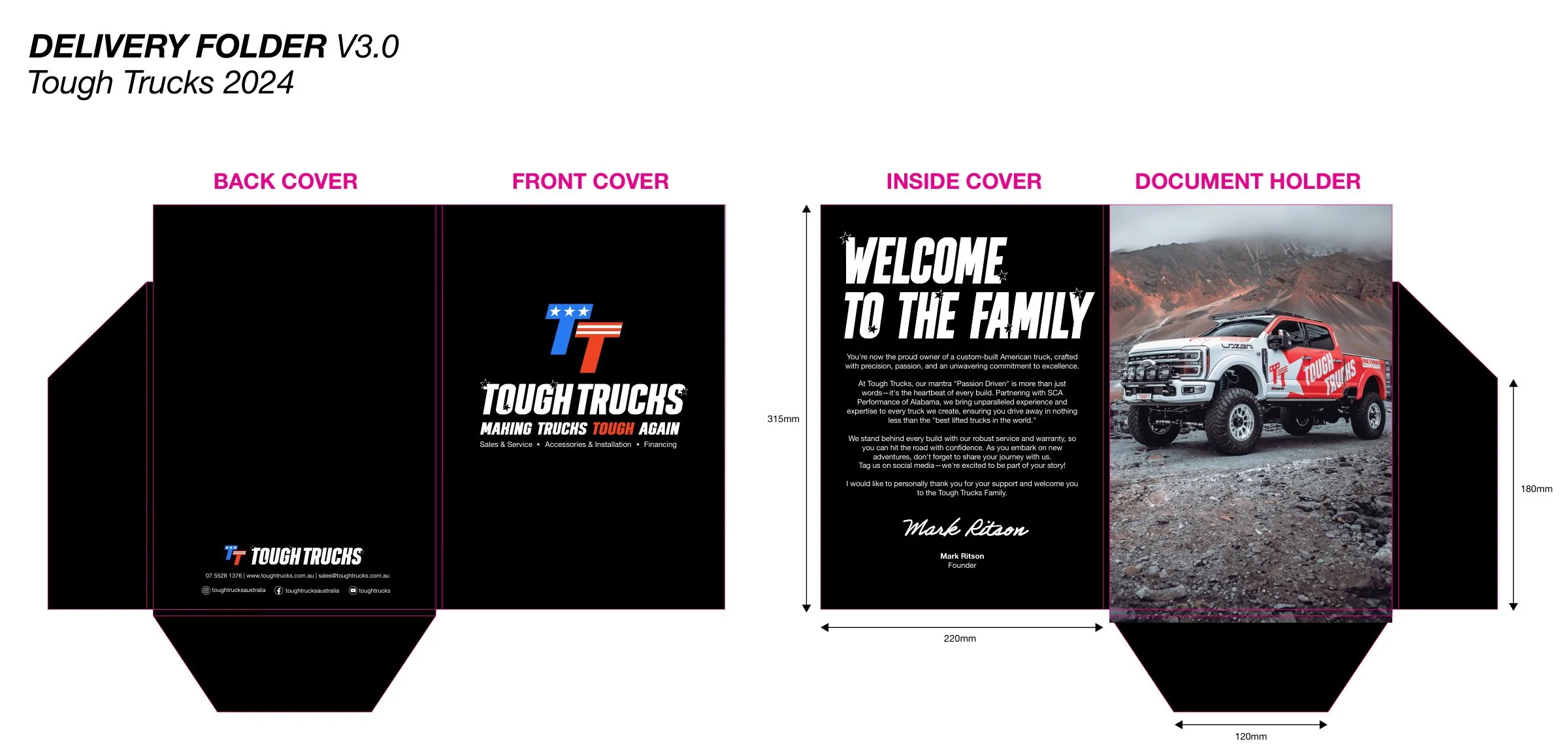
The delivery folder gives the paperwork a consistent home. Its restrained black exterior lets the identity lead, while the production artwork resolves the panels, pockets, folds and bleed required to turn the layout into a physical object.
06 / The full picture
Built forthe bigger view.
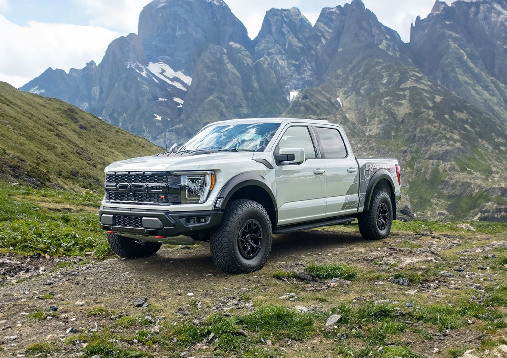
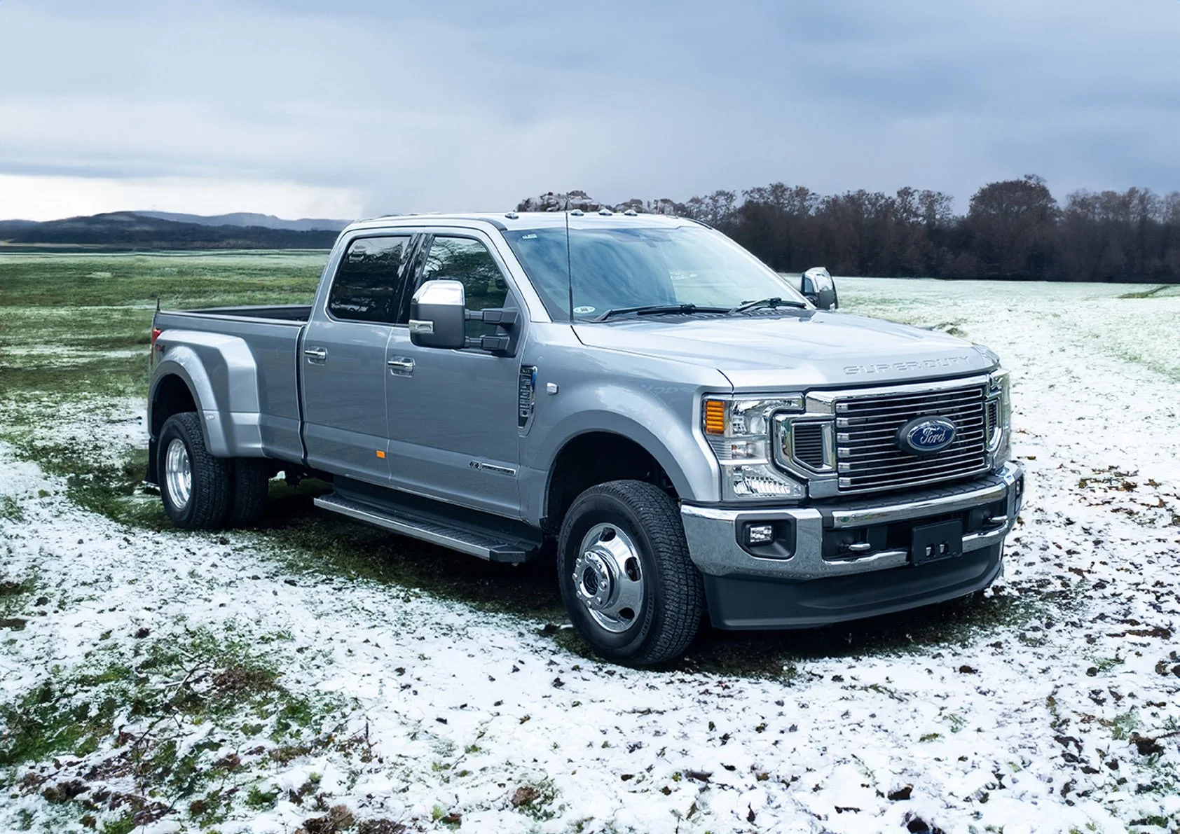
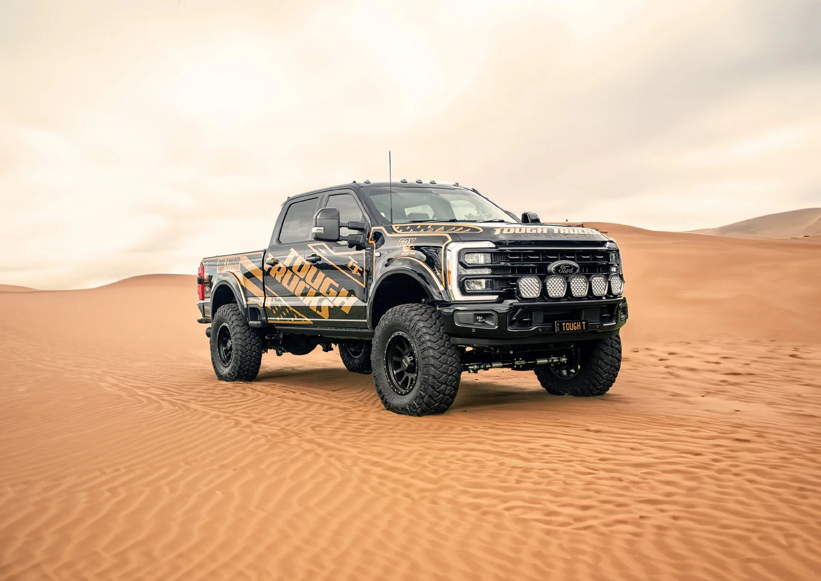
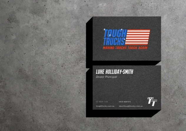
Across campaign artwork, printed material and the physical environment, the rebrand gives Tough Trucks a consistent set of visual tools. The individual applications vary in scale but share the same identity.