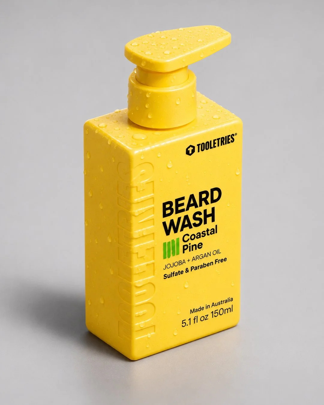
Brand identity, built into the bottle.
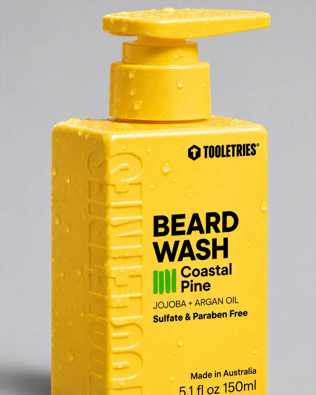
Product design and art direction for Tooletries’ wash range, spanning bottle modelling, debossed lettering, branding and logo development. The yellow body and bold typography carry across 150 ml and 500 ml formats, with the identity becoming part of the bottle’s surface.
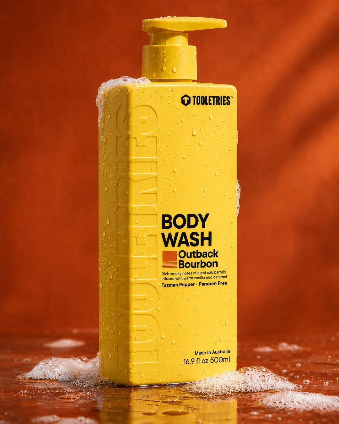
Identity in the surface
Debossedlettering.
The lettering follows the edge of the bottle, bringing the identity into the form itself. Light catches the surface detail, adding depth alongside the printed graphics.
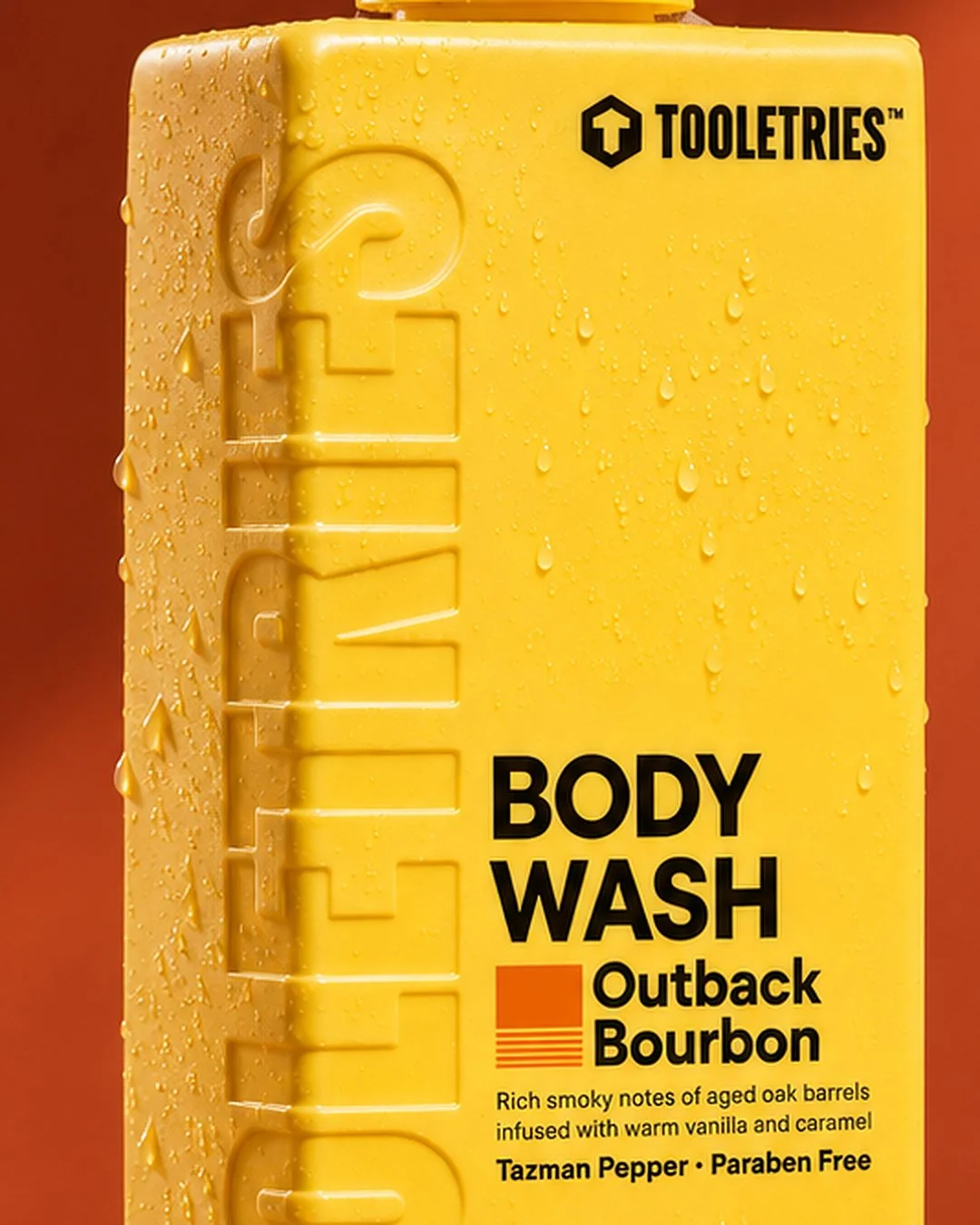
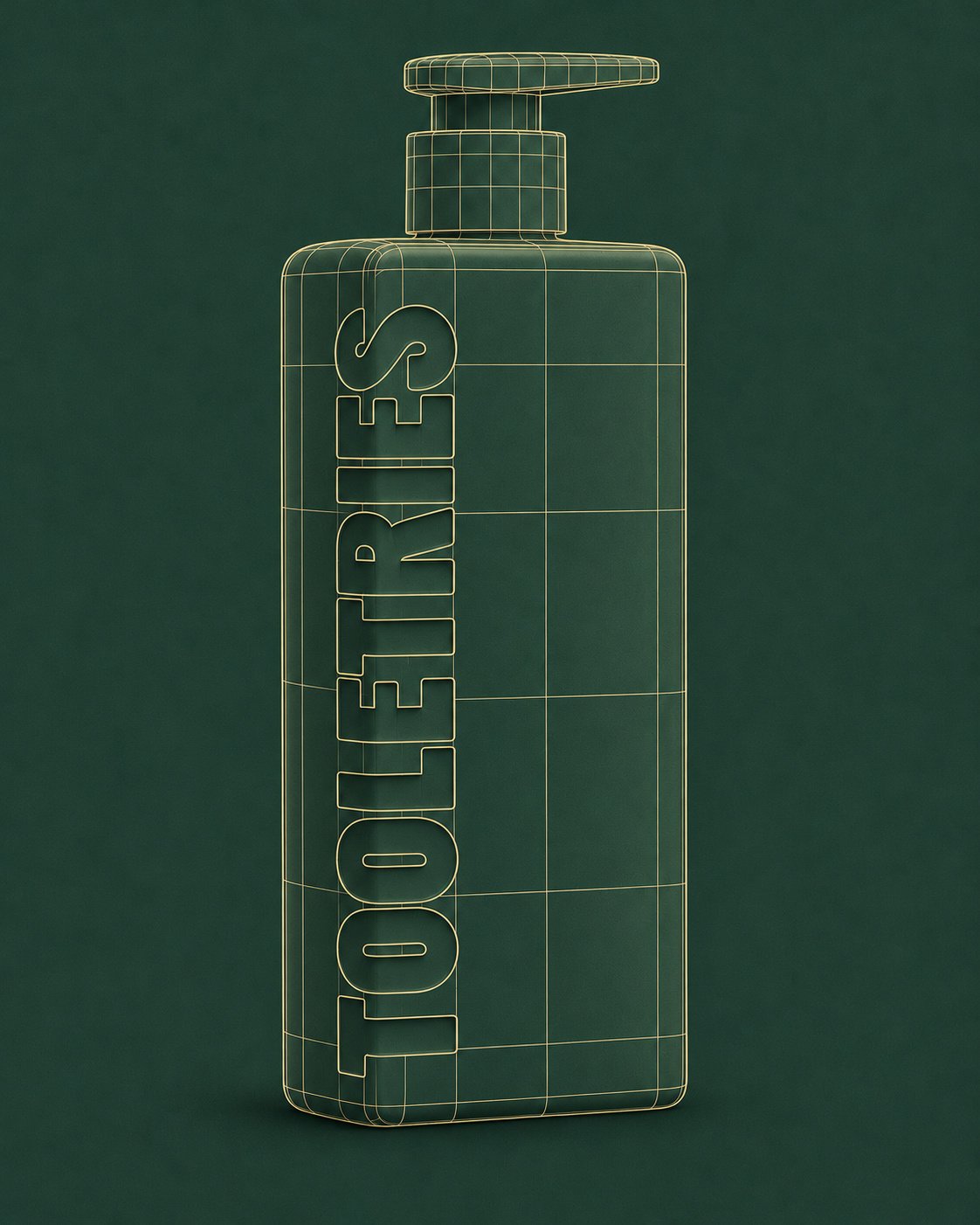
500 ml study
Bottleform.
A wireframe-style study of the 500 ml bottle’s proportions, pump profile and integrated lettering.
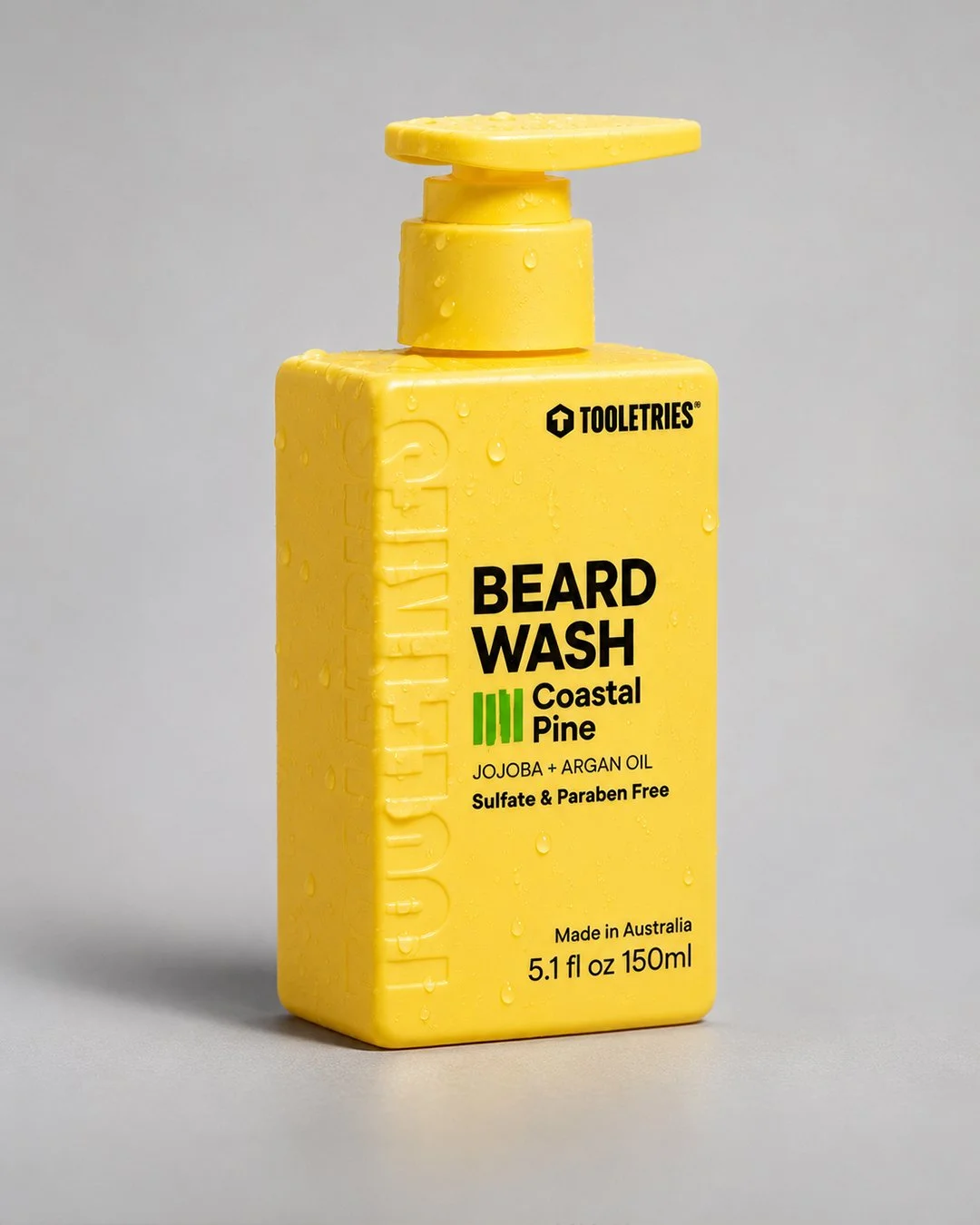
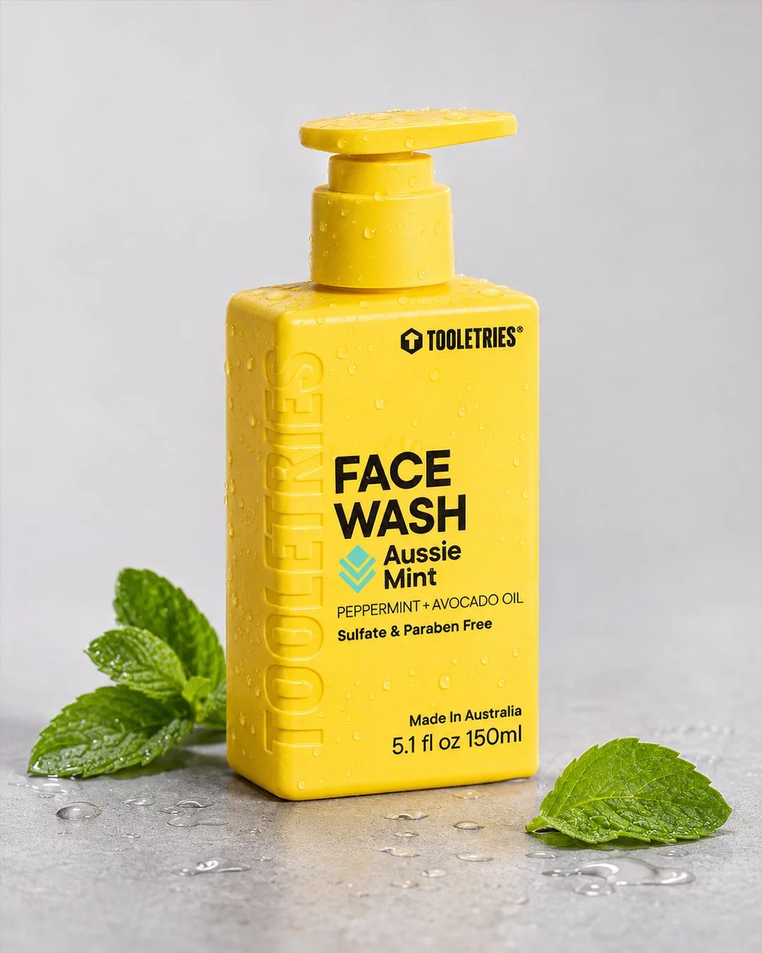
150 mlwash range.
Beard wash and face wash share a clear visual language: yellow bodies, strong black type and a distinct colour accent for each product.
Form meetsgraphics.