A softer identity, with room to play.
A rebrand for House of Speech, bringing eucalyptus greens, soft pastels and a more playful visual language across the practice. The work extends across podcast and social content, cue-card design, signage for the Kingaroy and Currumbin clinics and the House of Speech website.
TalkingTogether.
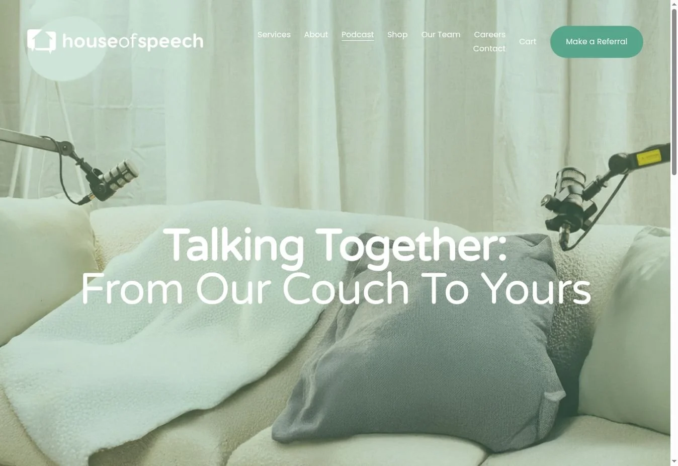
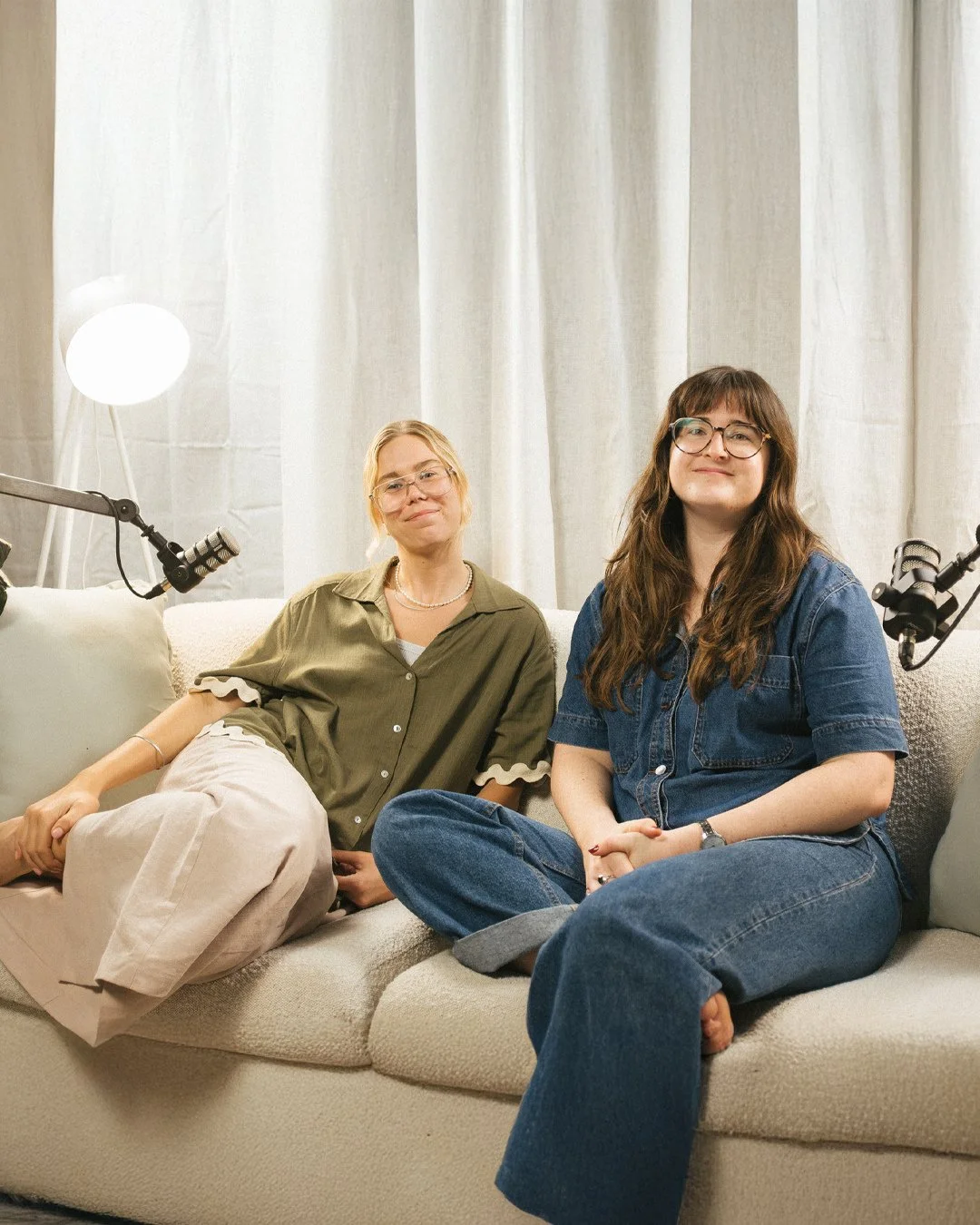
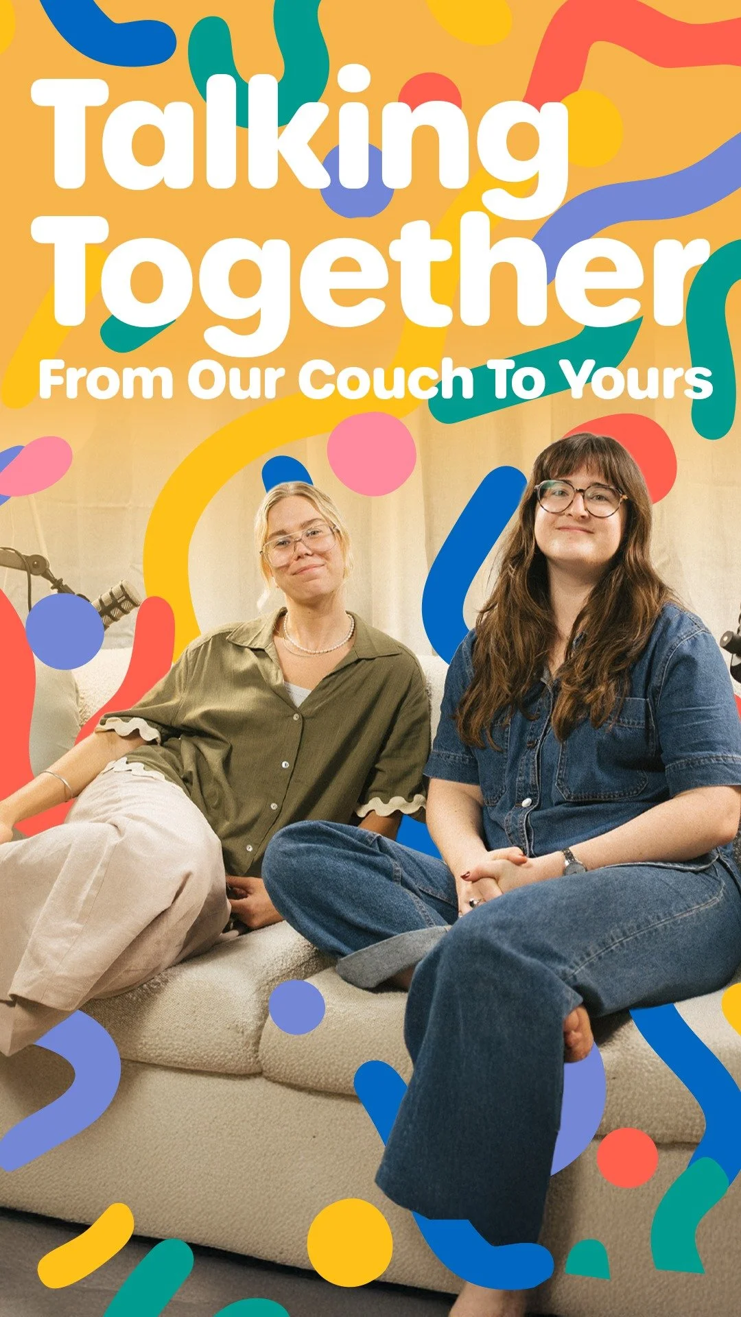
The playful visual language continues into Talking Together, with rounded type, loose shapes and bright colour framing the hosts. Podcast artwork and a vertical social edit give the conversations a recognisable place within the House of Speech brand.
From conceptto cards.
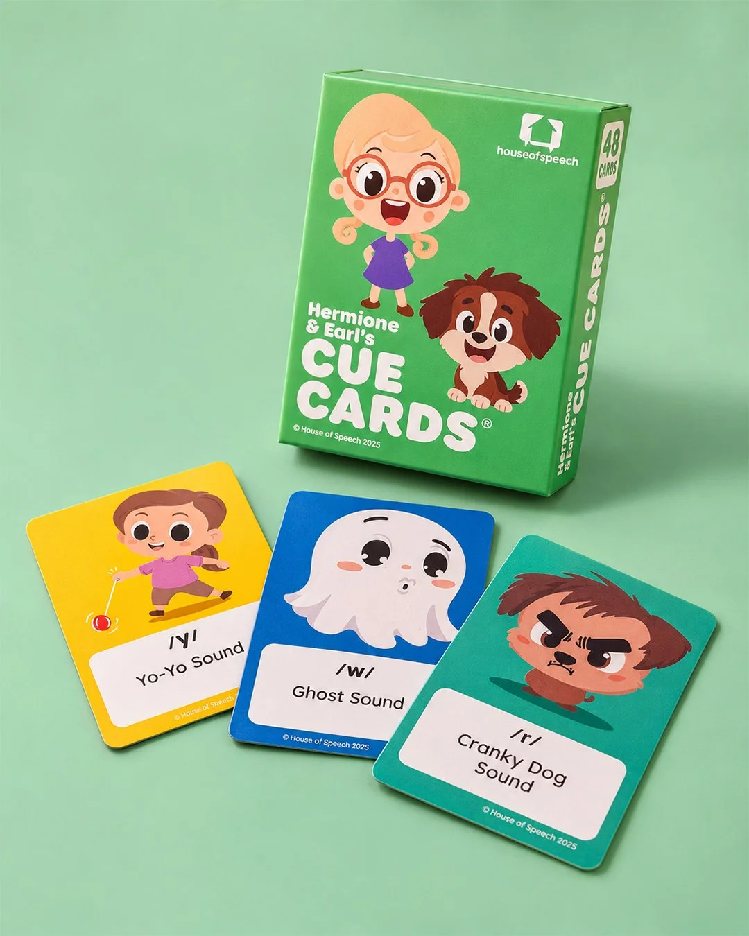
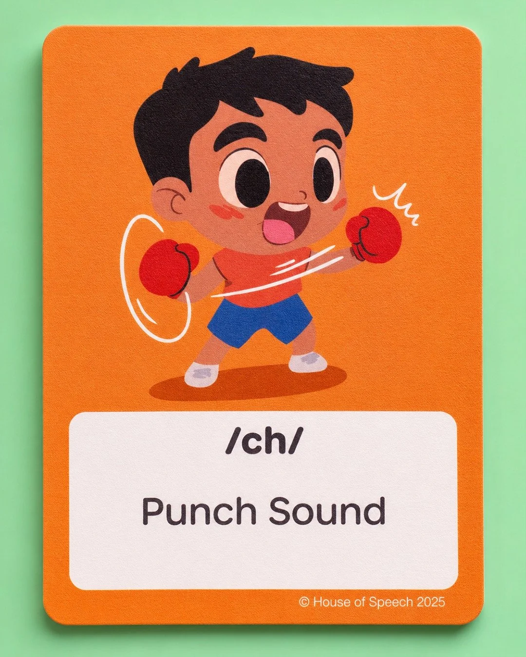
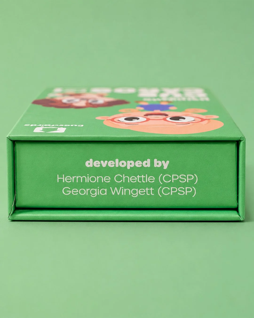
From concept through to final production, the cue-card work spans visual design, packaging and the finished physical set. Colourful characters give each sound a distinct visual cue while a consistent layout keeps the labels easy to find.
Resource development: Hermione Chettle (CPSP) and Georgia Wingett (CPSP).
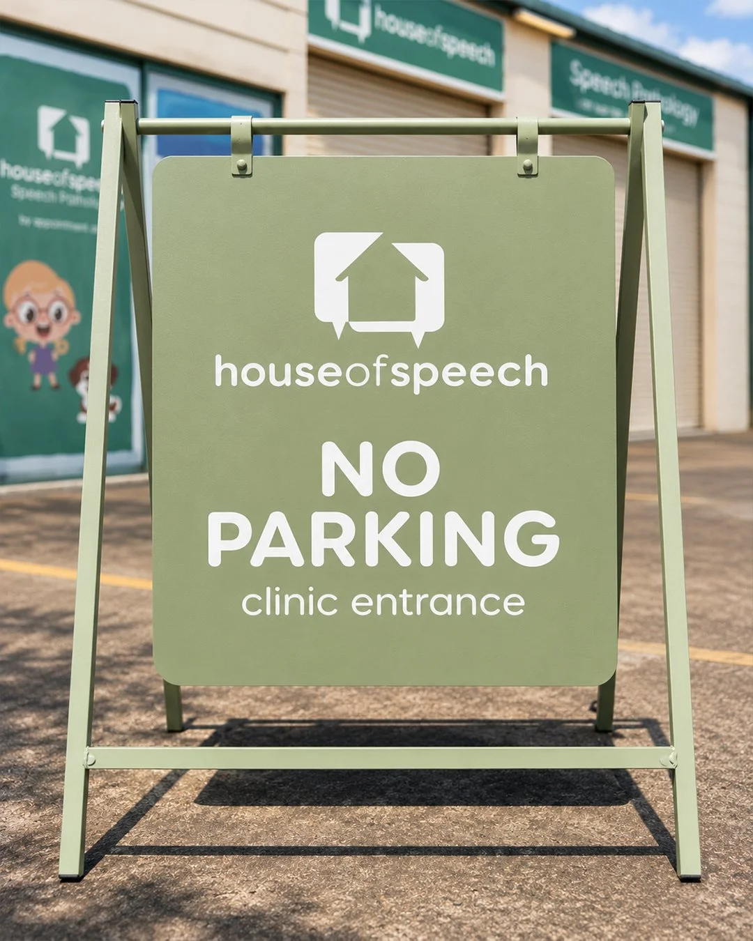
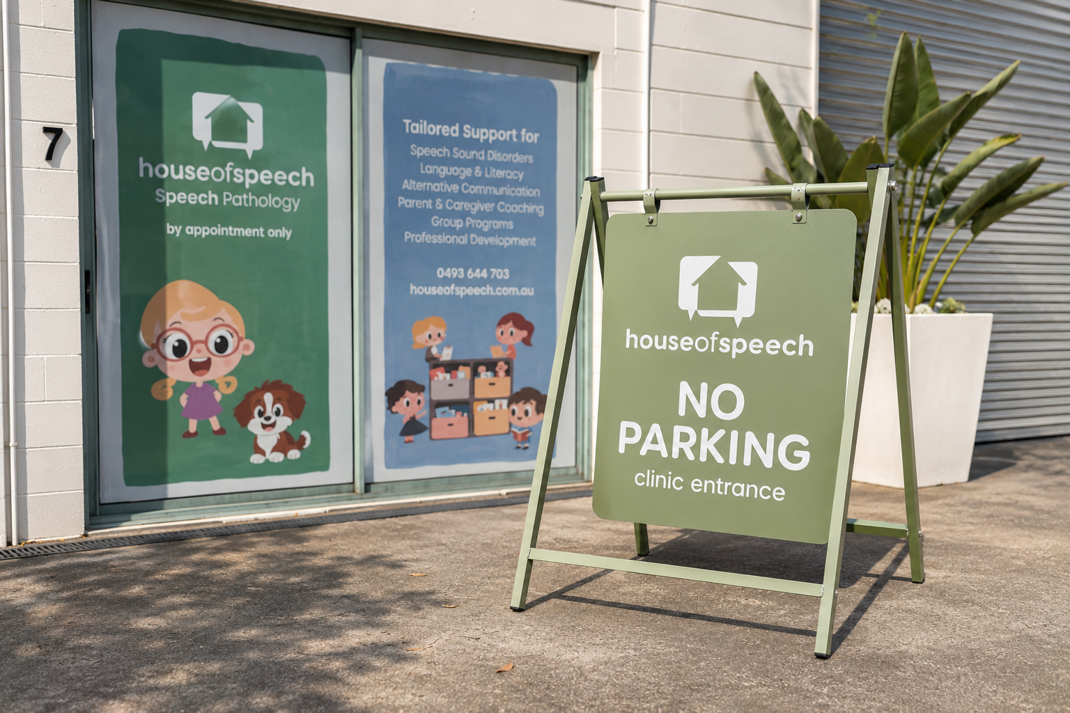
On thestreet.
The refreshed identity carries into signage for the Kingaroy and Currumbin clinics. The A-frame keeps the practical message clear, with the house mark and rounded lettering carried onto a matching green frame and panel.
At homeonline.
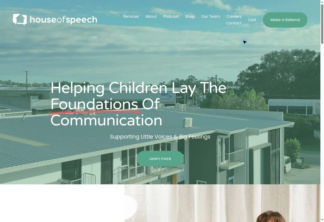
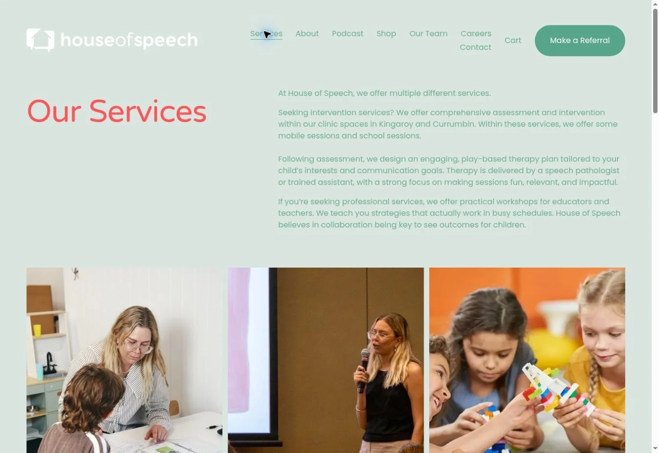
The identity carries through to the House of Speech website, bringing its services, resources and podcast into one place. Soft greens and rounded typography connect the digital experience with the wider brand.
Visit House of Speech ↗