Clear for teams. Familiar for families.
A rebrand and rollout for Busy Bees Australia, bringing a consistent visual approach to everyday documents, campaign materials, a vehicle wrap and an exhibition stand. A substantial part of the work lived inside the organisation: making the brand useful to the people working with it.
01 / Guidelines & internal communications
The everydaymatters.
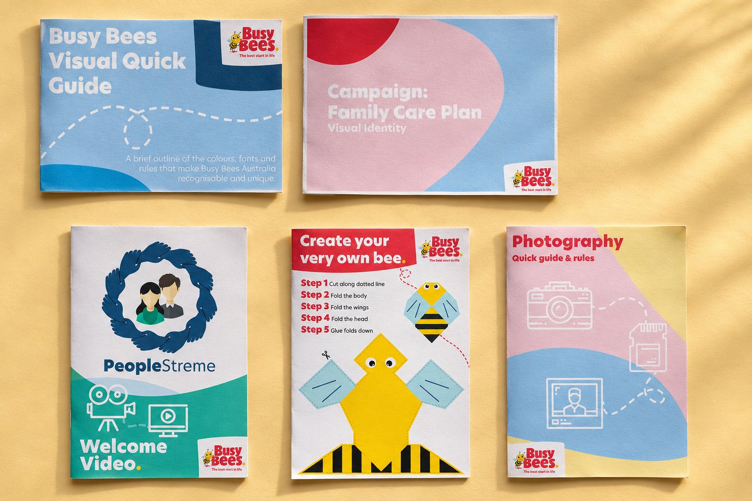
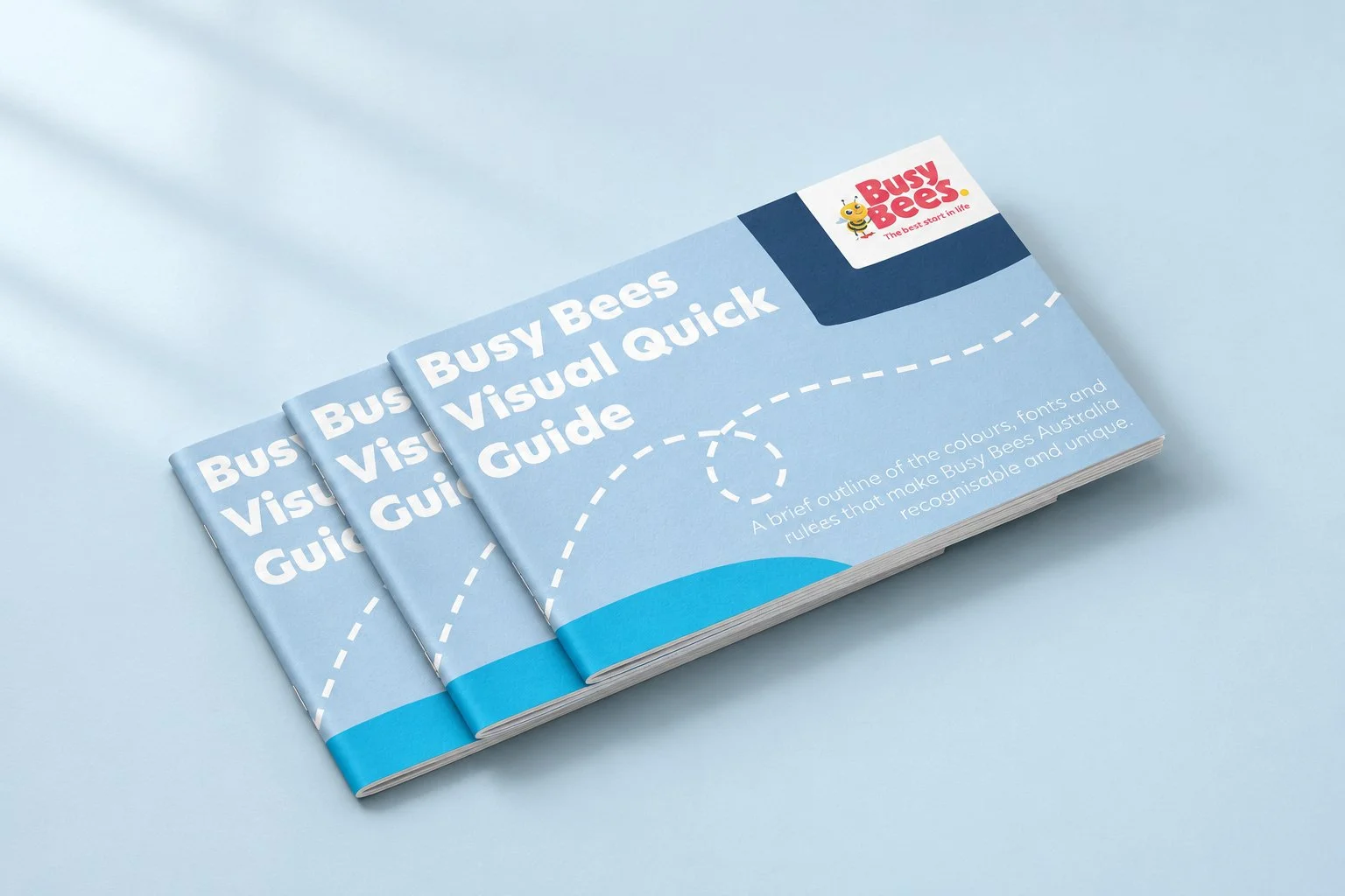
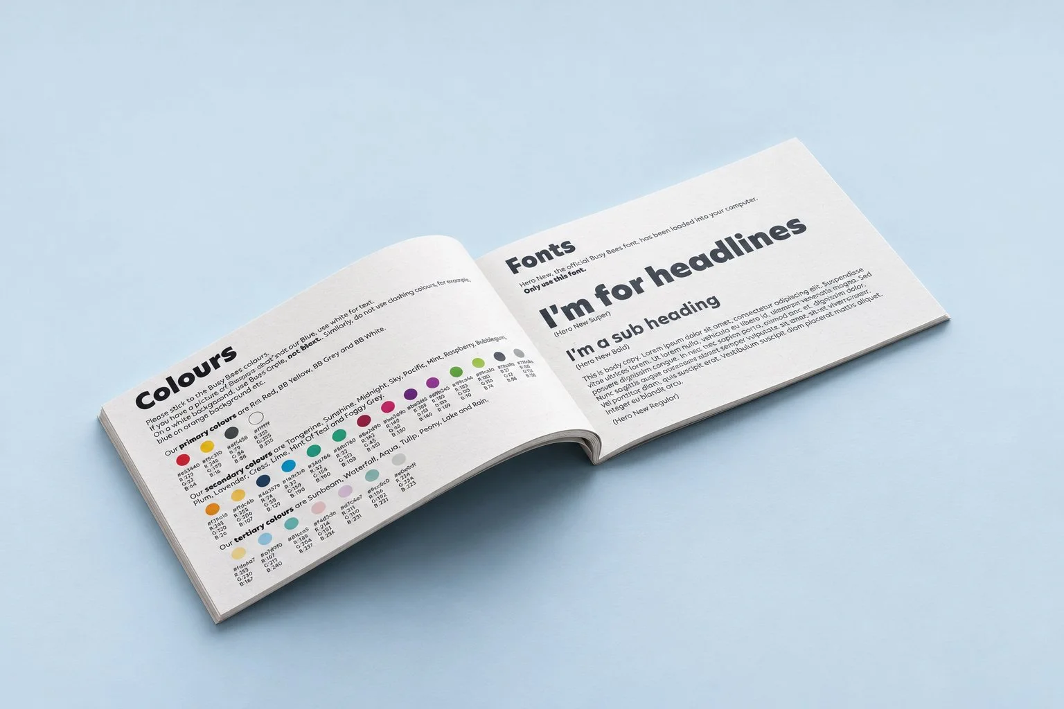
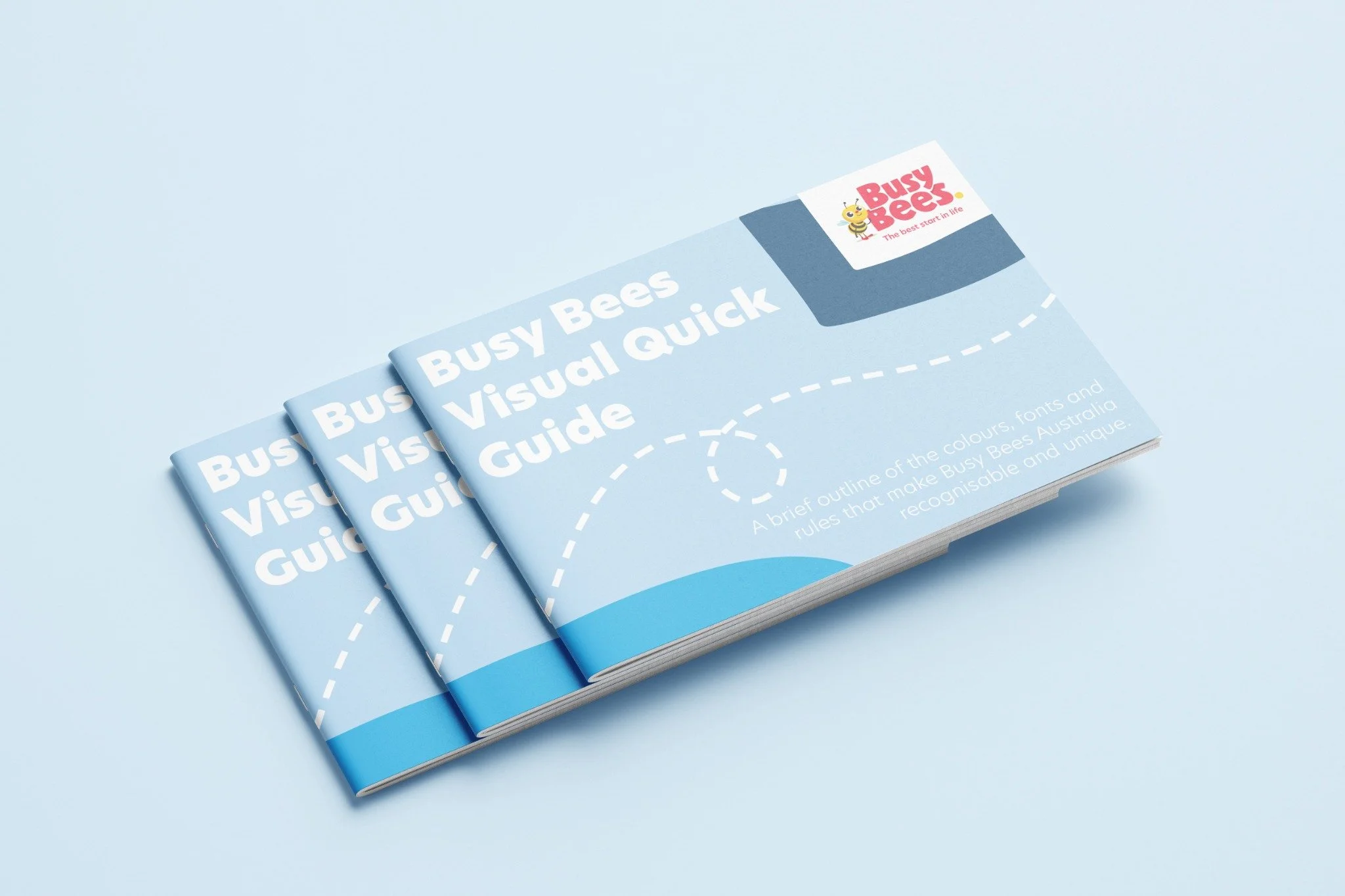
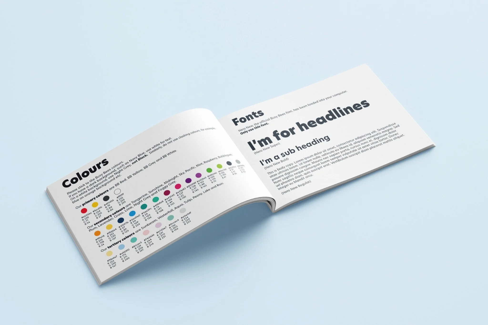
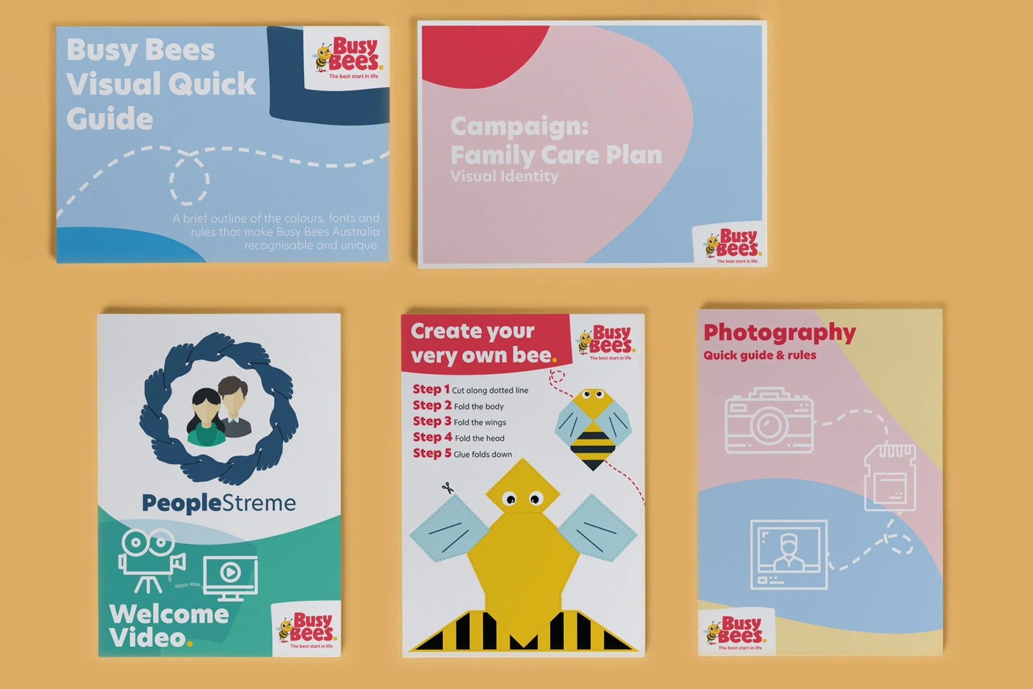
Much of the rebrand was carried by documents used within the business. The visual guide, photography guidance, campaign material and staff resources bring the same typography, colour and graphic language into the practical details of daily work.
View original design references
02 / Recruitment & onboarding
A welcomefrom within.
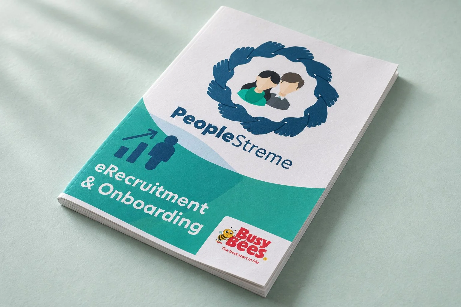
The PeopleStreme recruitment and onboarding material gives internal communication a clear, approachable identity. The ring of hands provides a human focal point, carried through the supporting documents and welcome video cover.
03 / Vehicle graphics
Out inthe world.
The bus wrap takes the identity onto the street: the Busy Bees wordmark, a large yellow field and a clear website address work with the shape of the vehicle. The wrap was produced in real life; the photographic view below has been reconstructed from the supplied design.
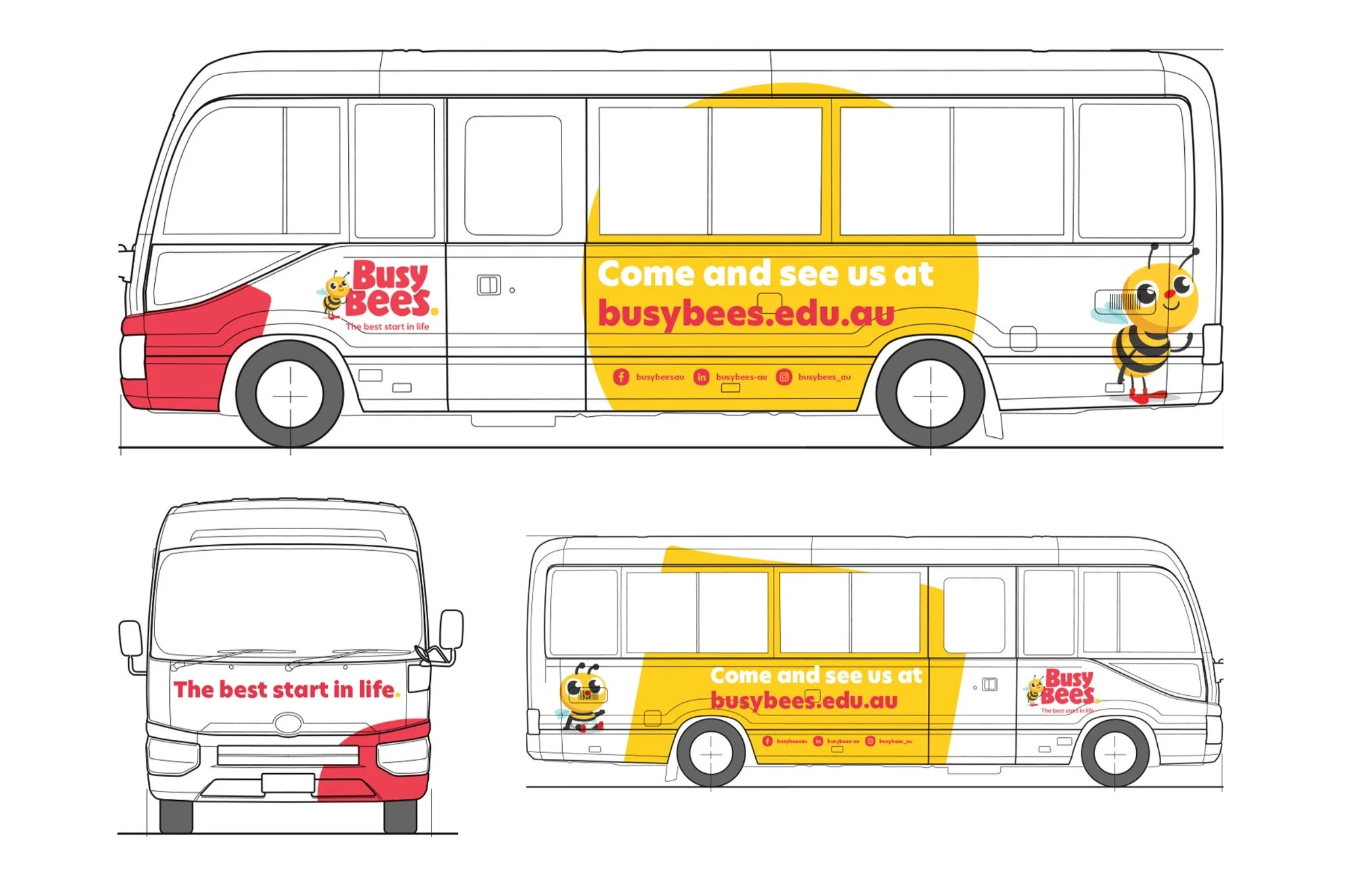
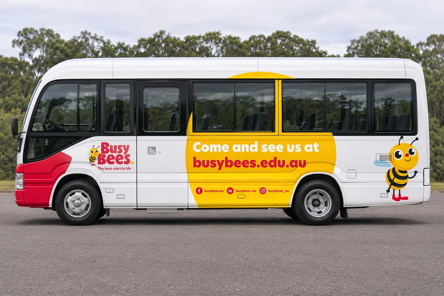
Swipe or use the arrows to compare the original artwork with the photographic reconstruction.
04 / Perth expo
A placeto meet.
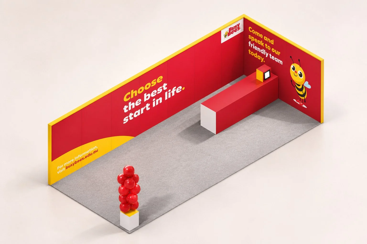
The six-by-two-metre stand brings the brand into a compact exhibition space. Red and yellow establish a clear presence, while the open frontage, simple counter and familiar bee character give visitors an immediate point of approach.